Beyond Recency Bias

Published August 16th, 2021
Recency Bias occurs when a small or recent sample of trades is used to draw big picture conclusions.
During certain time windows the performance and metrics of a strategy will fluctuate due to market conditions within those windows.
You may have a system that offers a 65% trade win rate but in small windows it may drop to 40%. You may have a system that shows an 18% annual return over 25-years, yet in some windows this may decline to 5%.
This is important because most new or inexperienced traders tend to suffer from Recency Bias.
If a trader has 5 losing trades in a row immediately after starting a new strategy, they may consider that the strategy has no merit. They may tweak and make adjustments. They may abandon it altogether.
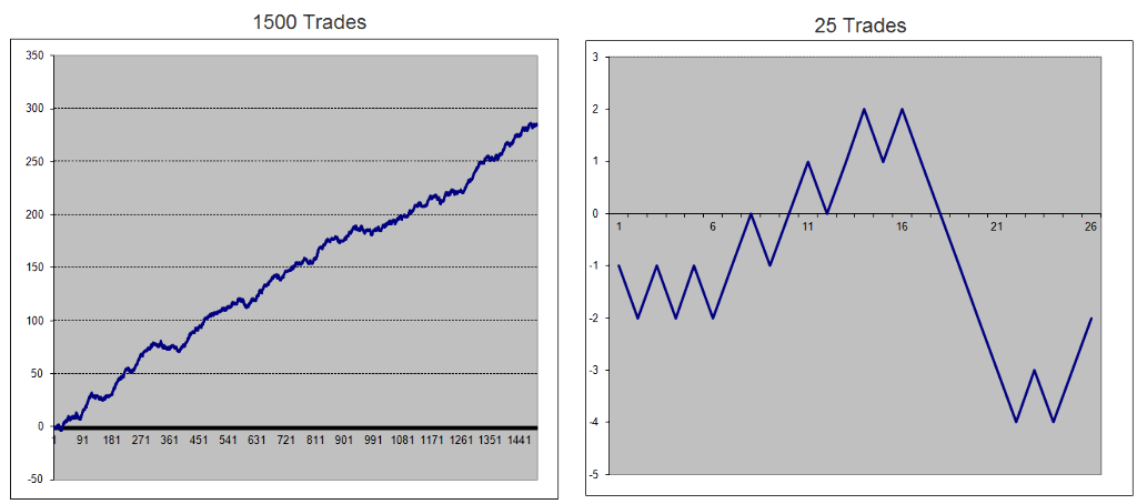
Equity Growth Chart
Simply put, when we look at a very long term equity growth chart, one that trends nicely, what we don’t see are the short term hiccups the system endures.
Consider the two equity growth charts below. Both are from the same strategy, albeit here we’re using a random trade generator. The chart on the left shows a 1500 trade sample of Strategy-XYZ.
It would be reasonable to suggest that most new traders would be enticed to start trading this strategy – it shows long term consistent equity growth with minimal downside events.
Yet what they don’t see within this larger sample is what happens in the short term windows, such as the example on the right. This 25 trade sample shows a window that doesn’t look overly enticing, indeed it looks quite ugly and would be discarded by 95% of new or inexperienced traders.
Which brings me to the Premium Portfolio that is currently under-performing the broader market.
Am I worried?
Should I override the strategy and get fully invested?
Do I change the strategy so I get in earlier?
The answer is NO.
And the reason is my extensive research was to ‘look under the hood’ and see how the strategy performs over various time windows – good and bad.
Not every strategy will work perfectly all of the time. It certainly doesn’t for Warren Buffett so I should swallow my ego and accept that it will also be the same for me.
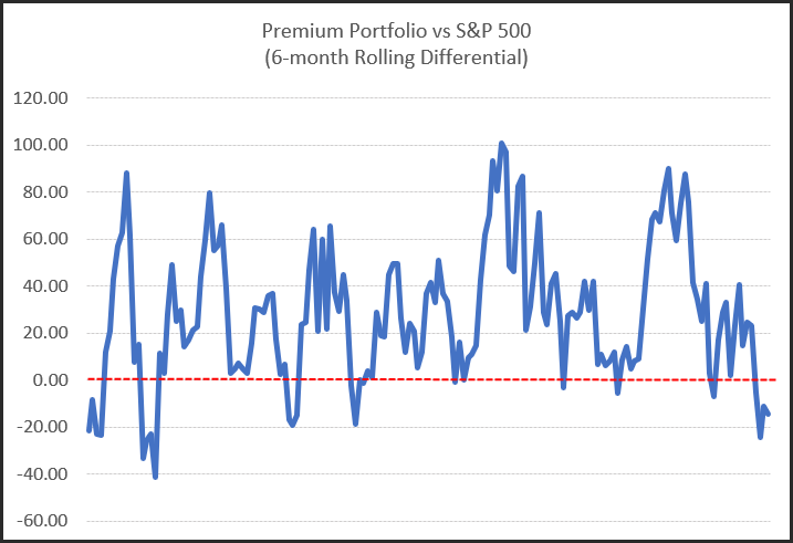
The following charts show the rolling differential between the Premium Portfolio and the S&P 500 back to 2005.
Chart 1.
The first chart is for every 6-month window stepped in 1-month intervals. Of the 164 occurrences the portfolio has outperformed the broader market 86.6% of the time.
Chart 2.
The second chart shows every 12-month window also stepped in 1-month intervals. It shows the portfolio beating the broader market in 93% of any 12-month time window.

In summary, using an evidence based approach such as the Premium Portfolio, I can deep dive into performance metrics to reassure myself that what’s going on at the moment is nothing to be concerned about and that I should ignore near term ‘noise’ and remain focused on the long term expectation of the strategy.
